Inspired EHRs: Designing for Clinicians
7
Human Factors Principles
Systems that complement how we see, read, think and decide can improve our performance.
What is Human Factors Engineering?
Human Factors Engineering seeks to improve human performance by designing systems that are compatible with our perceptual, cognitive, and physical abilities. Imagine an EHR that requires a physician to cancel a prescribing task, then navigate through several screens, remember a value, and navigate back to complete the prescription. This EHR taxes the well-known limits of human memory. Over-taxing users’ memory causes them to make errors, especially if they’re interrupted while using the system – a common occurrence in healthcare.
In contrast, an EHR that allows a physician to see at a glance how well a patient is controlling his diabetes and hypertension gives the physician the situational awareness (and time) he needs to begin to address his patient’s current concerns. The physician can focus attention on understanding the story of the human sitting across the room, instead of on remembering and finding the necessary information to make decisions.
The Fundamental Theorem of Biomedical Informatics states “that a person working in partnership with an information resource is ‘better’ than that same person unassisted.” Human Factors Engineering involves building this partnership, designing hardware and software that make it as easy as possible for users to do tasks safely and efficiently. An EHR based on sound human factors engineering principles can help clinicians focus on the difficult task of caring for patients, rather than on figuring out how to use or work around the EHR. We must understand the ways people see, read, think and decide so that we can use this information to build systems that enhance people's job performance.
7.1 How People Perceive
7.1.1 Our Eyes Have Expectations
Our eyes are drawn to familiar patterns. Sometimes we even see patterns we know and expect instead of what's actually there.
Your eyes take in data, but your brain 'perceives' this data and parses it into meaningful visual information. Our brains create shortcuts to help us make sense of the estimated 40 million sensory inputs they receive per second. They use our expectations, past experiences, associations, and learned rules of thumb to make guesses about what it is we're looking at. Everyone has seen something at a glance and thought it was a certain object, and then focused on it and realized it was actually something else.

Most people read the following as “The cat,” even though the middle letter in each word is exactly the same, and neither is a perfect H or A. Our perceptual system uses context (the letters around the middle letter) and expectations (predicated on our familiarity with common English words) to allow us to cope with and make sense of imperfect, noisy input. But the same properties that make our perceptual system robust can also lead us astray. For instance, can you name the first drug on this prescription (Figure 7.2)?
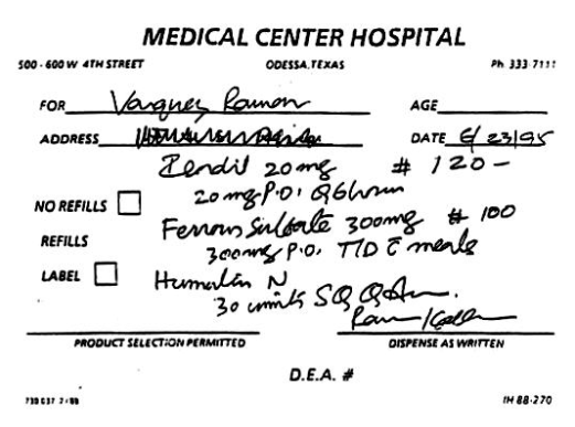
The cardiologist who prescribed the medication wrote 'Isordil,' but the pharmacist read it as 'Plendil.' After taking the prescribed medication for two days, the patient had a heart attack. Several days after that, he died1. In this case, the pharmacist was led astray by the very same perceptual system that enabled him to do his job correctly most of the time. Our perceptual system makes assumptions so automatically that we often don’t even realize that it is doing so.
Users come to computers with expectations (mental models) based on what they have seen before, and with a built-in tendency to make assumptions about what it is they're seeing. When we scan a screen, we look for digestible chunks: familiar things like navigation bars, buttons and logos. We also tend to look at the center of the screen rather than at the edges, because we expect the edges to display less important things, like logos and tools not relevant to the task at hand. We expect the core components of an interface to be front and center, easy to find.
Affordances tell users at a glance that particular elements of the graphical user interface are functional devices. Well-designed affordances also give users an idea of what will happen when they use them.
7.1.2 We See in Gestalts
People perceive whole shapes, or gestalts, rather than disconnected forms.
Gestalt is a German word for form or shape. In English, it has come to have connotations of ‘wholeness.’ When you walk into a room, you immediately form an overall sense of what's going on therein and its corresponding emotional tone. Most people understand when they've come in and interrupted a fight, even if they heard none of the previous conversation. When you view a webpage for the first time, you get a similar overall impression of it. You can say pretty quickly whether you think the site looks cluttered or appealing, modern or out of date. Several design elements feed into our gestalt impressions of sites and applications.
Proximity
The distance between objects determines what we perceive the relationships between those objects to be. If things are close together, we assume that's significant and 'group' them in our minds. If elements in a designed object are grouped together, we assume this was intentional and is meaningful.

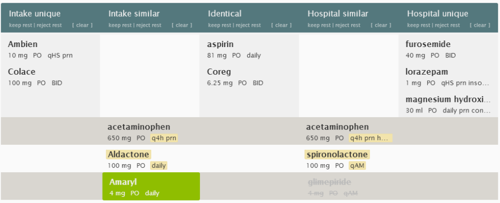
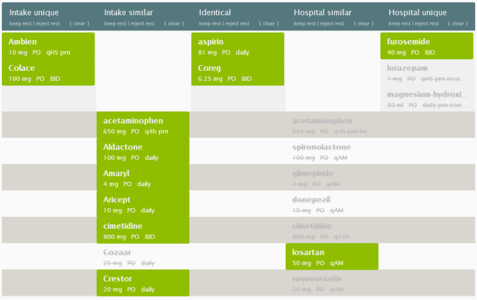
Example: The medication reconciliation view below (Figure 7.10) breaks medications into groups. It then places these groups in the same columns. Users can tell there are different groups (columns) at a glance, without having to focus on, read, and understand all the information on the chart.
Closure
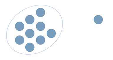
Our brains fill in visual blanks for us and draw conclusions with less than complete information. This helps us make sense of the world quickly. Sometimes we can draw the wrong conclusions, misleading our users. We need to keep the advantages and shortcomings of this perceptual habit in mind when we design systems. Designers can make use of our brains' tendency to fill in the blanks to help users to quickly understand a whole idea based on a partial picture, but design can also accidentally lead users to unintended and unhelpful 'false' gestalt impressions.
Example: Our minds take lines or curves and build objects out of them. This is how we can know we're looking at something that's supposed to represent a person when it's a stick figure. Even though the lines below don't add up into a circle and a rectangle, people can still see and identify both shapes.

Similarity
We perceive visual elements that look similar as parts of a group. Designers can indicate that two objects are similar, and thus related, by giving the objects the same sizes, shapes or colors. Interfaces that visually group related items are easier to use than those that don't. As a general rule, items that users must process together could be grouped together, while items that need to be processed separately are not.
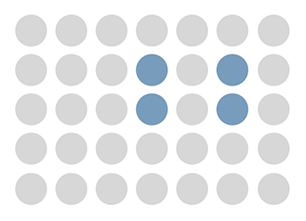
Example: In the medication reconciliation interface we looked at earlier, proximity marked certain groups of items as categories (columns). Now, when we add color, we create new groups (Figure 7.13). Medications the user approves turn green, and medications the user deselects fade to light gray.
Symmetry
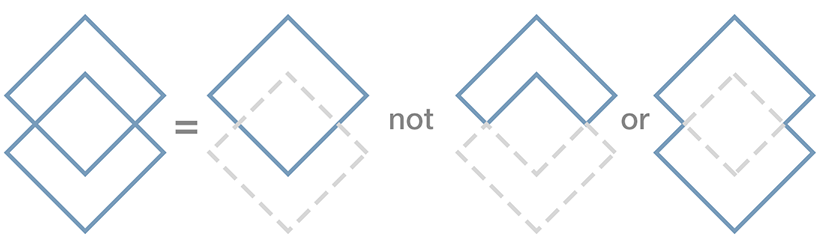
Our minds like to make sense of complex visual fields by assigning them a perceived center and attendant symmetry.
Example: Figure 7.14 shows us how our minds like to see two symmetrical diamonds rather than other, equally possible (but less pleasingly symmetrical) shapes.
Example: When we first glance at Figure 7.15, below, we see two columns. In fact, a series of individual entries creates the illusion of columns.
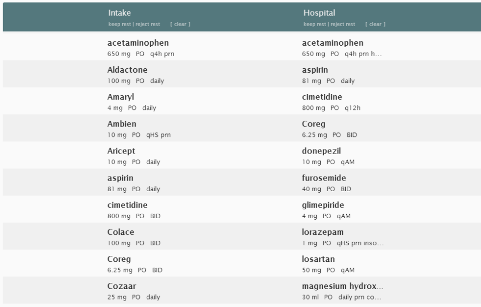
Figure / Ground
Our brains perceive objects either as figures in the foreground or as part of the background. Whatever we're focusing on becomes the figure, and everything else shifts into the background accordingly.
Example: In Figure 7.16 below, the ampersand is the figure, distinct from the blue rectangle that serves as its ground or background. As the designer intended, users understand the figure to be more important than the ground.

Example: Figure 7.17 below is the classic Edgar Rubin image in which viewers see either two faces or a vase, depending on where they focus their attention. Rubin was a practitioner of gestalt psychology.

Continuity
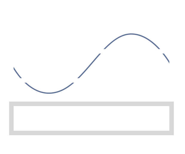
In day to day life, our perception combines and relies on all of these components. Alignment creates groupings of items, and these groupings are said to have continuity. Our brains expect and try to reconcile contours into continuous objects.
- 7.1 a Though a rectangle 'blocks' parts of this curve...
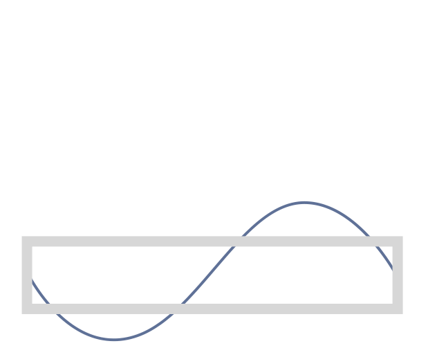
- 7.1 b ...humans perceive both the curve and the box as whole, uninterrupted entities...
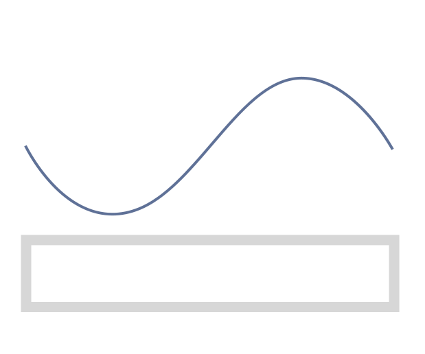
- 7.1 c ...rather than as a box and some line segments.
Example: Figure 7.18 demonstrates several of the things we've been talking about. When we look at it, our brains detect the proximity of different medication lists and categories and the similarity of 'selected' and 'deselected' groups of medications. The list also takes advantage of the contrast we perceive between figure and ground. The dark text seems closer to us, and the faded text seems further away.
7.1.3 I Can't See It but I Use It
We use our peripheral vision to get a big picture of what we're seeing, and we use that big picture to help us decide what to focus on.
Our visual system consists of our eyes and the brain processes that work with them. This system does an amazing job of seeking out and providing us with visual information. It does so mostly without our being consciously aware of it. We are barely aware that only the very central part of our vision provides us with a sharp-focused image, detail rich, with color information. The periphery of our vision (outside of the central “peephole”) is fuzzy, and drained of color. That peripheral part of the vision is, however, able to detect features such as motion, edge, and contrast. These features guide our brains in making their "visual query" of the views before us.
Rapid eye movement enables our brains to sample the environment. The task we're trying to accomplish determines the details we unconsciously seek out. If we're looking for a friend, we notice faces in the crowd. If we're trying to find our way through the crowd, we notice the gaps between people.
Animated ads are effective (and annoying) because our peripheral vision detects motion. We want to ignore the ads, but their design takes advantage of the way vision works. Our eyes are drawn to anything that stands out. Our brains are trying to recognize threats in our environment, and our peripheral vision is always alert to differences and changes.
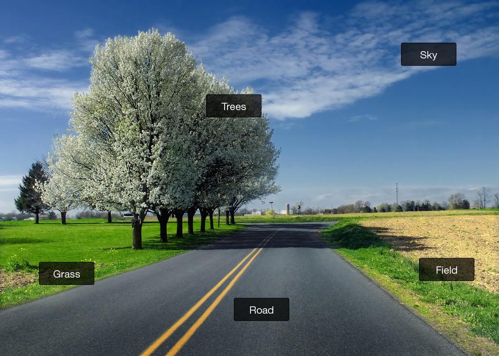
Example: When we look at Figure 7.19, below, our eyes first do a quick visual query. They seek out major landscape elements and the details that will help us accomplish whatever we're using this display to do. What we notice in the scene below will vary depending on whether we're driving, deciding if we need to mow the lawn, or assessing if the weather will be suitable for a picnic this afternoon.
Example: When we look at a display like Gallery 7.2 below, we think we see something like the first image. Actually, what we really see at any given instant is something more like the second image. We only focus on a small area at any given moment. Our visual brain first latches onto a preattentive attribute like the red text, and is disproportionately drawn to that element. Then our eyes automatically scan to find the next point of visual interest.
- 7.2 a We Think We See This
- 7.2 b ...But We Actually See This
A peripheral glance tells people where they are and what to expect, helping us decide what to focus on. We can only truly see what we focus on. The display can only effectively convey that information at any given time.
Design tip: Feedback and error messages can pop up near an area people will already be focusing on. While we do use our peripheral vision to orient ourselves and scan for things, we also tend to ignore our peripheral vision when we're trying to focus on the task at hand.
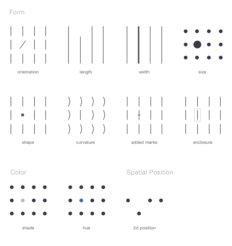
7.1.4 Preattentive Attributes
Little, visual things people notice and understand quickly
We notice some visual features, such as color, size, shape, orientation, and motion, more quickly than others. We call the things that especially stand out to us preattentive attributes. Before we fully process visual information, our minds prompt us to focus on these attributes. Things that stand out from the rest of their environment, as in Figure 7.20 below, do so because of their attention-catching preattentive attributes.
7.2 How People Think
7.2.1 The Two Ways People Think
Everyone has two modes of thinking. There's a rapid mode that requires little conscious effort and a slower mode that requires focus.
If a system is easy to understand and work with, users don't have to engage with it via their 'slow, focused' mode of thinking. They can just use their rapid mode and save their mental energy for more important matters. Daniel Kahneman wrote a great book about these modes, and our thinking builds on his work.
The rapid mode of thinking is automatic and almost effortless. People often don't experience a sense of voluntary control over it. This mode allows us to:
- See that something is larger than something else
- Answer simple computations, like 2+2 = 4
- Read words on a billboard
- Understand simple sentences
- Make rapid and simple associations, such as stereotypes (positive or negative)
- Notice preattentive attributes
Our focused mode of thinking is effortful and allows us to perform more complex mental activities. We associate this mode of thinking with our experiences of agency, choice, and concentration: in short, with our 'consciousness.' This mode allows us to:
- Focus on listening to one voice in a noisy room
- Recall information, like addresses and phone numbers
- Evaluate the validity of a complex argument
- Scan for a particular piece of information in a long article
When creating an application, ask yourself whether you have any opportunities to convert tasks that require focused thinking into tasks that only require rapid thinking. Making the application perform complex calculations, sort information, and concisely present key details can free people up to do the focused thinking that only humans can.
The Twinlist medication reconciliation prototype, Figure 7.21, makes the focused task of scanning two lists and finding similar drugs into a rapid one. The prototype identifies similar drugs and sorts them onto the same row. Twinlist also makes it easy for users to see the differences between similar drugs by highlighting these differences in yellow. A slow, visually and cognitively demanding search task involving two separate lists becomes a matter of brisk perception with Twinlist.
7.2.2 Working Memory
Working memory demands effort and is limited. Try to design systems that place limited demands on users' working memory.
Working memory, or short-term memory, holds items like phone numbers until we can write them down or punch them into our phones. This type of memory stores information for less than a minute and demands focused thinking.
Design tip: Try not to ask people to look at information on one screen, remember it, and then enter it into another field on another screen.
If you ask people to use their working memories, make sure that what you're asking them to remember is uncomplicated. Don't distract them with additional demands, information and options while they're focusing on remembering a given bit of information. A system that interrupts people while they're trying to use their working memories causes them to forget what they're doing and wastes time.
People only keep three to four compound or complex items in their working memories at a time. The way interfaces display bits of information can influence users' working memory, however. If a design groups items together or breaks information down into manageable chunks, people can remember that information better. A phone number, for example, is easier to remember if it's been broken into chunks. Compare these numeric strings:
Difficult: 9121889874
Easier: 912-188-9874
Easiest: (912) 188-9874
The first phone number is difficult to even just dial. If the interface asks users to enter phone numbers, it can allow them to enter these with or without the intervening hyphens or parentheses. It could display them, however, in the easy-to-read format. When the interface needs to display an unmanageable amount of information, and the design has done all it can to alleviate this, the interface can then 'chunk' its information in the manner of the phone number example.
7.2.3 Cognitive Load
Loads are heavy, even mental ones. Help lighten the user’s load.
Our brains manage motor, visual and cognitive loads. The strain of managing and manipulating items within our working memory generates cognitive load. Motor load is the easiest for the brain to manage, while cognitive load is the most difficult.
Designers seeking to lighten users' cognitive loads need to bear these details in mind:
- Focused thinking causes greater cognitive strain than rapid thinking. People can give a task about ten minutes of focused attention, but then they'll need a short break, unless they're particularly interested in the task or are in a flow state.
- People can’t truly multi-task. We can only attend to one task at a time. When we think we’re multitasking, we’re actually rapidly switching tasks, start-stop-start-stop-start-stop. This can tire us out and cause us to make mistakes.
- Recognizing is easy, remembering is difficult. We can recognize complex things like a map of Europe instantly, but most of us would likely have a hard time drawing such a map ourselves. Likewise, we find it easier to recognize patients' names than to recall them.
- Problem-solving and calculating are hard, while learning from experience and performing learned actions is easy.
Example: Figure 7.22 below demonstrates the mental work a doctor does when she reviews a medication list to try to understand what medications a patient is taking to control his blood pressure. She must read the list, recognize drugs' names, remember whether given drugs are prescribed for hypertension, recall from memory what the maximum doses for these medications are, and then check whether the patient has reached the maximum dosages for these medications. That's a lot of mental effort!
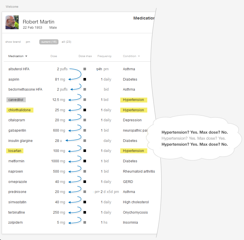
Figure 7.23, below, sorts the list of drugs alphabetically by diagnosis. This allows our physician to access the same information, but costs her far less mental effort. Lightening the effort she has to expend on this task increases the amount of effort she can spend on other more important tasks.
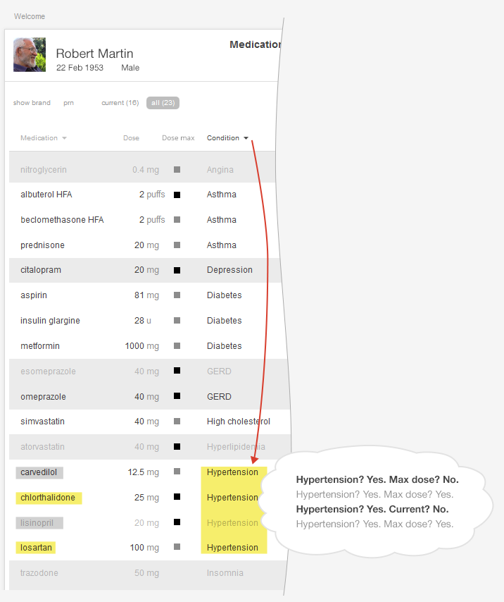
If the interface can indicate whether a medication has reached the maximum dose, this will save the doctor the effort of making a series of annoying calculations.
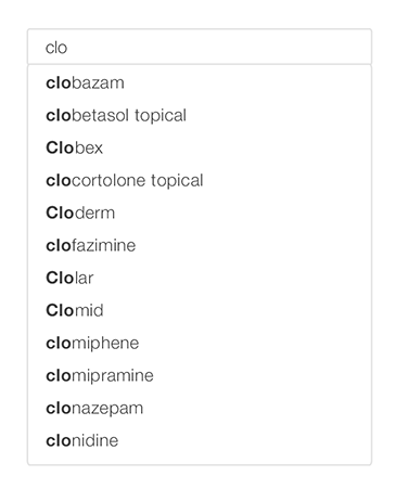
Example: Auto-complete functions can also lighten users' cognitive loads. Users typing in the name of a drug in a window with a predictive text function can employ low-impact recognition mental processes rather than more difficult recollection processes. If users employ rapid thinking at this stage of the proceedings, however, there's a danger that they might mistake similarly-named drugs. Employ tallman lettering to alert users to be aware that a similar-looking drug exists.
7.2.4 Everybody Likes a Chunk
Breaking information down into small, digestible chunks helps people make sense of it.
Human brains can only apply focused thought to a relatively small amount of information at a time. Interfaces must break information into chunks. They can give users information in manageable, controlled courses, like a formal dinner.
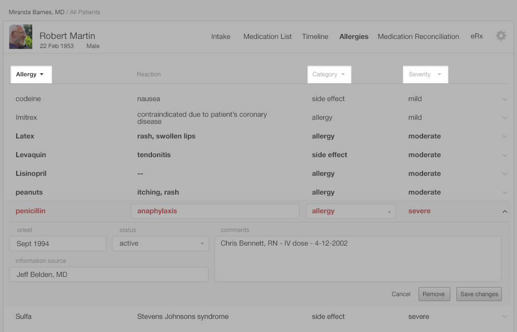
Progressive disclosure gives people the information they need when they need it. The interface gradually provides users with more and more detail. Designers need to develop a good knowledge of how their users will be working to understand what information they could begin with, and then what details can be introduced at successive stages. Keep in mind that people can only hold three to four things in their mind at once.
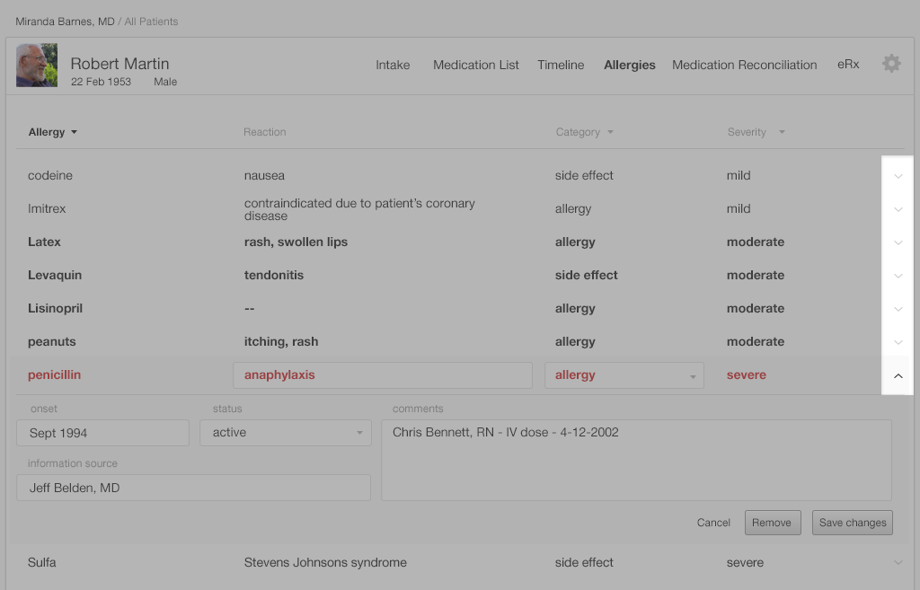
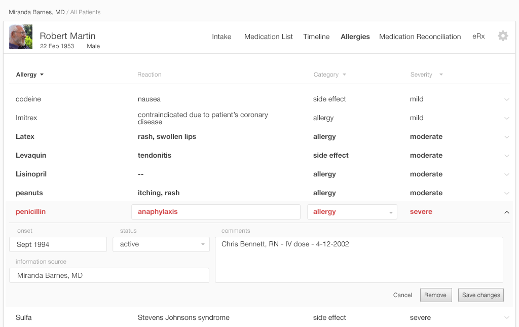
Example: The list in Figure 7.25 shows essential allergy information in four columns. The user has all the information she needs about the patient's medication allergies to make prescription decisions. If she needs additional information about the patient's allergies, she can select an entry to see more details.
7.2.5 Goal, Execute, and Evaluate!
Humans have a thought cycle that guides decision making and it is 'Goal, Execute and Evaluate.'
How do we get anything done? No, really. We start by forming a goal: get some food, edit a word document, impress our boss with our design skills, etc. Next we choose and execute actions that we think will help us accomplish that goal. Finally, we evaluate how well our actions worked. Were we able to accomplish our goal, or to at least make progress towards accomplishing it?
Interfaces can support clinical decision making if their designers establish a shared understanding of goals with physicians. The interfaces must then provide users with clear paths by which to accomplish these goals, useful 'action' choices, and the feedback they need to quickly and accurately make choices and evaluate their progress. If interfaces don't provide appropriate or sufficient feedback, users make errors and find the interface unsatisfying to use. This is a common problem with interfaces.
7.2.6 Go with the Flow
People like to get into flow states; if we're engrossed in what we're doing, everything else falls away
We've all had moments where we get so involved in what we're doing that we lose track of time and get a lot done. This situation is called a 'flow state,' and you can enter it doing professional or (more likely) recreational tasks. No one likes having their flow state interrupted.
Interfaces can help users get into and stay in flow states. Some facts to remember:
- People like being in control of themselves. Giving them control over their activities will help them get into the flow.
- Distractions, in the form of noisy interfaces or interruptions from co-workers, interrupt peoples' flow.
- People like goals that are challenging but achievable.
- Break difficult tasks down like you would unmanageable amounts of information. Allow users to complete long or difficult tasks in clearly-defined stages.
- Give users feedback on their progress. Seeing how far they've come and how far they still have to go can motivate people.
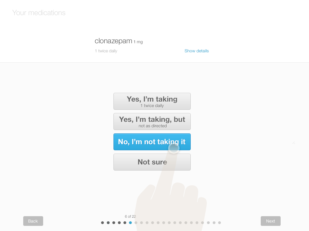
Example: Figure 7.26 shows a medication list that a patient is in the process of updating. The page indicator on the bottom shows the patient that he's on step 2 of 22. This information about his progress may help the user get into a flow.
7.3 How People Manage Information
7.3.1 Information Chaos
Too much information going through my brain, too much information driving me insane.
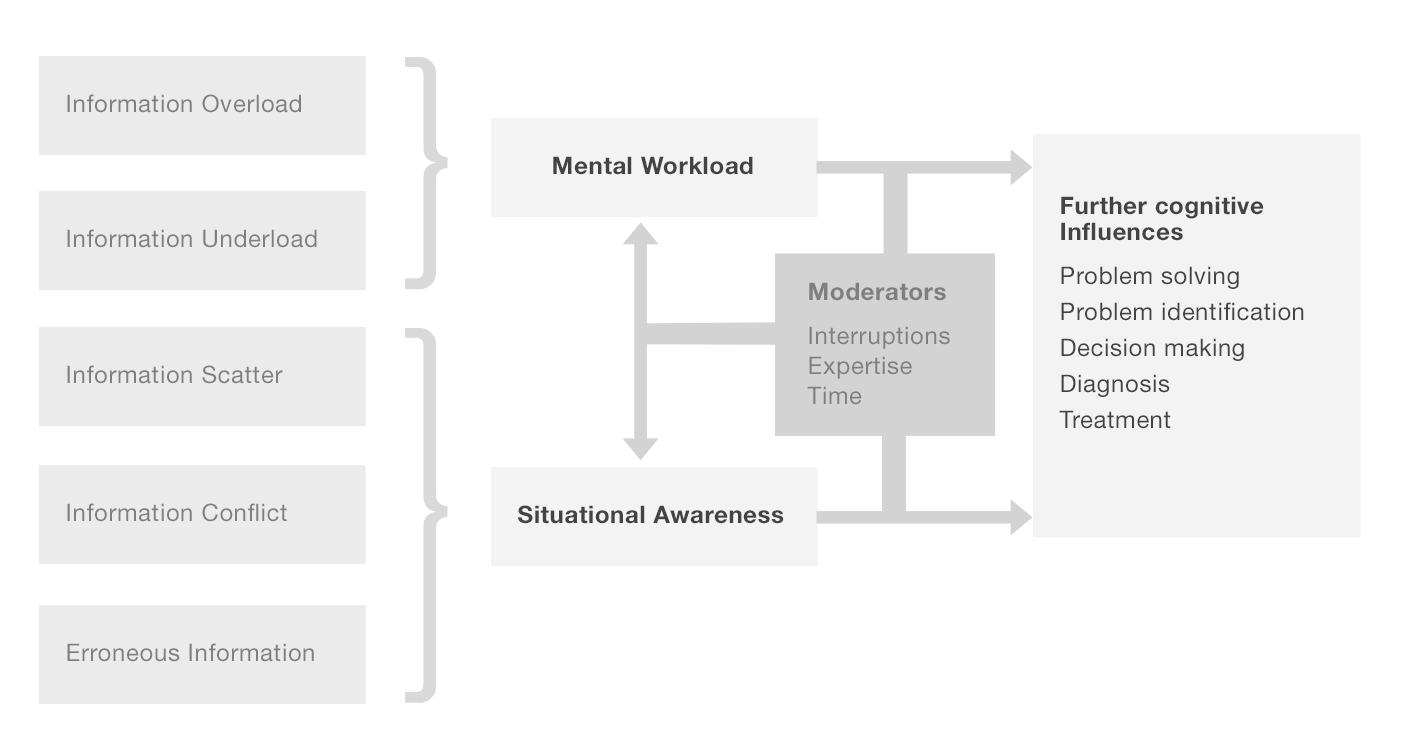
Five things lead to a state John Beasley and his colleagues have called information chaos: information overload, information underload, information conflict, erroneous information, and information scatter.
Information overload happens when we're being asked to make sense of information quickly, but there's too much information for us to do so. This makes us tired and even anxious. It also reduces our situational awareness. Without good situational awareness, we can miss important information because we're 'unable to hear the signal for the noise.'
Information underload happens when we lack sufficient information to make decisions.
Information conflict happens when an interface gives us contradictory information or information contradicting what we already know.
Erroneous information is information that, for whatever reason, isn't correct.
Information scatter happens when someone has access to all the information they need, but it's in several locations or formats and can't easily be reconciled into a complete picture.
If an interface allows for any of the above issues, a doctor could miss noticing important information, like a dangerously high blood pressure reading, and put her patient at risk.
Example: This walkthrough demonstrates the factors involved in information chaos.
Reproduced by permission of the American Board of Family Medicine
7.3.2 Situational Awareness
Interfaces must help users put all the elements of complex situations into perspective so they can make good choices
Situational awareness is an important component of everything from ordinary tasks like driving a car to emergency services. Effective EHR displays can improve users' situational awareness by presenting them with key information without disrupting their work.
It's difficult to design EHRs that can improve users' situational awareness, however, because the information users need varies depending on both the user and the task at hand. What's important for the user to know about one patient may not be important for them to know about another. Yet despite the situation's complexity, designers can meet this challenge. If a patient has a chronic disease such as diabetes or hypertension, an interface can help users quickly assess and manage these conditions. The interface need never force users to stop, for example, writing up an e-prescription to go look for the lab result they need in order to calculate a proper dose. Designers need to strike a balance between giving users lots of information to boost their situational awareness, and overwhelming them (see information overload).
Users' situational awareness suffers when they're distracted. If two children are arguing in the back seat, the car's driver won't be able to give her full attention to the road. Similarly, alerts about laboratory values may be important, but they may also distract a physician who's trying to order a medication and cause her to make a mistake.
7.4 Summary
- Human Factors Engineering seeks to improve human performance by designing systems that are compatible with our physical, cognitive, and perceptual abilities.
- We subconsciously use expectations, past experience, associations, and rules of thumb to make guesses about what we are seeing. This lets us cope with noisy, incomplete data, but can also lead us astray.
- We have two modes of thinking, fast thinking that happens with little conscious effort and slow thinking that takes focus. Good design lets us use our fast system to do as much as possible.
- Working memory is limited to four things. Good design minimizes the need to use working memory.
- The more we have to remember and calculate in our heads, the higher the cognitive load. Good design reduces cognitive load by reducing the need to remember information and displaying information that can be used in decision making without additional calculations or navigation.
- Good information system design allows a user to quickly gain or maintain the situational awareness needed to make safe and effective decisions.
This book was last updated 10 Nov 2014.
The designs in this book were created by our team and reviewed by a national panel of clinical and human factors experts, but have not been empirically tested against existing designs.
References
Our Eyes have Expectations
- Charatan, Fred. “Compensation Awarded for Death after Illegible Prescription.” Western Journal of Medicine 172, no. 2 (February 2000): 80
- Kannengiesser, U., & Gero, J. S. (2012). A process framework of affordances in design. Design Issues, 28(1), 50-62.
- Norman, D. A. (1999). Affordance, conventions, and design. Interactions, 6(3), 38-43.
- Roth, S. P., Schmutz, P., Pauwels, S. L., Bargas-Avila, J. A., & Opwis, K. (2010). Mental models for web objects: Where do users expect to find the most frequent objects in online shops, news portals, and company web pages? Interacting with Computers, 22(2), 140-152.
- van Schaik, p. & Ling, J. (2009). The role of context in perceptions of the aesthetics of web pages over time. International Journal of Human-Computer Studies, 67(1) 79-89.
- Weischenk, S.M. (2011). 100 Things Every Designer Needs to Know About People. Berkeley, CA: New Riders. 13-14.
Images
- Figure 7.2, Charatan, Fred. “Compensation Awarded for Death after Illegible Prescription.” Western Journal of Medicine. 172, no. 2 (February 2000): 80. from: http://www.ncbi.nlm.nih.gov/pmc/articles/PMC1070756/
- Profile photo in interfaces by pedronchi
We See in Gestalts
- Wolfe, J. M., Kluender, K., R.; Levi, D, M., Bartoshuk, L, M., Herz, R. S., Klatzky, R, L., Lederman, S. J. (2008). Gestalt Grouping Principles Sensation and Perception (2nd ed.). Sunderland, MA: Sinauer Associates.
- Johnson, J (2010). Simple guide to understanding user interface design rules: Designing with the mind in mind. Burlington, MA: Morgan Kaufman.
- Rubin, E. (1921) Visuell Wahrgenommene Figuren: Studien in psychologischer Analyse. Kobenhaven: Gyldendalske boghandel.
Images
- Figure 7.11, Gestalt_closure [SVG file]. (2008). Retrieved January 28, 2014 from: http://en.wikipedia.org/wiki/File:Gestalt_closure.svg
- Figure 7.17, Ruben, E. (psychologist). (1921). Faces-Vase [SVG file], Retrieved January 28,2014 from: http://en.wikipedia.org/wiki/File:Cup_or_faces_paradox.svg
- Gallery 7.1, Few, Stephen (2013): Data Visualization for Human Perception. In: Soegaard, Mads and Dam, Rikke Friis (eds.). The Encyclopedia of Human-Computer Interaction, 2nd Ed. Aarhus, Denmark: The Interaction Design Foundation. Available online at http://www.interaction-design.org/encyclopedia/data_visualization_for_human_perception.html
I Can’t See It, but I Use It
- Larson, A., & Loschky, l. (2009). The contributions of central versus peripheral vision to scene gist recognitions. Journal of Vision, 9 (10:6), 1-16.
- Johnson, J (2010). Simple guide to understanding user interface design rules: Designing with the mind in mind. Burlington, MA: Morgan Kaufman.
- Ware, C. (2005). Visual queries: The foundation of visual thinking. Knowledge and Information Visualization (pp. 27-35). Springer Berlin Heidelberg.
- Weischenk, S.M. (2011). 100 Things Every Designer Needs to Know About People. Berkeley, CA: New Riders.
Preattentive Attributes
- Atienza, M., Cantero, J. L., & Escera, C. (2001). Auditory information processing during human sleep as revealed by event-related brain potentials. Clinical Neurophysiology, 112(11), 2031-2045.
- Appelbaum, L. G., & Norcia, A. M. (2009). Attentive and preattentive aspects of figural processing. Journal of Vision, 9(11), 1-12.
- Egeth, H. E., Yantis, S. (1997). Visual attention: Control, representation, and time course. Annual Review of Psychology, 48, 269-297.
- Few, S. (2009). Now you see it: Simple visualization techniques for quantitative analysis. Oakland, CA: Analytics Press.
- Kourtzi, Z., & Kanwisher, N. (2000). Cortical regions involved in perceiving object shape. Journal of Neuroscience, 20, 3310-3318.
- Krummenacher, J., Grubert, A., & Müller, H. J. (2010). Inter-trial and redundant-signals effects in visual search and discrimination tasks: Separable preattentive and post-selective effects. Vision Research, 50(14), 1382-1395.
- Van der Heijden, A. H. C. (1996). Perception for selection, selection for action, and action for perception. Visual Cognition, 3(4), 357-361.
Images
- Figure 7.20 Few, S. (2004). Data Presentation: Tapping the power of visual perception. Information Week. Retrieved from: http//www.informationweek.com/software/information-management/data-presentation-tapping-the-power-of-visual-perception/d/d-id/1026932?
The Two Ways People Think
- Evans, J., & Frankish, K. (Eds.) (2009). In two minds: Dual processes and beyond. New York, NY: Oxford University Press.
- Evans, J. (2008). Dual-processing accounts of reasoning, judgment, and social cognition. Annual Review of Psychology 59: 255-78.
- Kahneman, D. (2011). Thinking, fast and slow. New York, NY: Farrar, Straus and Giroux.
- Stanovich, K.E. West, R.F. (2000). Individual Differences in Reasoning: Implications for the Rationality Debate. Behavioral and Brain Sciences 23, 655-65.
Working Memory
- Cowan, Nelson (2008). What are the differences between long-term, short-term, and working memory? Progressive Brain Research. 169 (169): 323–338.
- Cowan, Nelson (2001). "The magical number 4 in short-term memory: A reconsideration of mental storage capacity". Behavioral and Brain Sciences 24: 87–185.
- Engle, R. W., Tuholski, S. W., Laughlin, J. E., Conway, A. R. (September 1999). "Working memory, short-term memory, and general fluid intelligence: a latent-variable approach". Journal of Experimental Psychology: General 128(3): 309–31.
- Revlin, Russell (2013). Human cognition: Theory and practice. New York, NY: Worth Publishers.
- Towse, J. N., Hitch, G. J., Hutton, U. (April 2000). "On the interpretation of working memory span in adults". Memory & Cognition 28 (3): 341–8
Cognitive Load
- Cowan, Nelson (2010). The Magical Mystery Four How Is Working Memory Capacity Limited, and Why? Current Directions in Psychological Science, 19 (1): 51-57.
- DeLeeuw, K.E., & Mayer, R.E. (2008). "A comparison of three measures of cognitive load: Evidence for separable measures of intrinsic, extraneous, and germane load". Journal of Educational Psychology 100 (1): 223–234.
- Paas, F., Renkel, A., & Sweller, J. (2004). Cognitive load theory: Instructional implications of the interaction between information structures and cognitive architecture. Instructional Science 32: 1–8.
- Paas, F., Tuovinen, J.E., Tabbers, H.K., & Van Gerven, P.W.M. (2003). "Cognitive load measurement as a means to advance cognitive load theory". Educational Psychologist 38 (1): 63–71.
- Plass, J.L., Moreno, R., & Brünken, R., ed. (2010). Cognitive Load Theory. New York: Cambridge University Press.
Everybody Likes a Chunk
- Keller, J. M. (1987). Development and use of the ARCS model of instructional design. Journal of instructional development, 10(3), 2-10.
- Cowan, Nelson (2001). "The magical number 4 in short-term memory: A reconsideration of mental storage capacity". Behavioral and Brain Sciences, 24: 87–185.
Goal Execute and Evaluate
- Card, S. K., Moran, T. P., & Newell, A. (Eds.). (1986). The psychology of human-computer interaction. CRC Press.
- Norman, D. A. (1988). The Design of Everyday Things. New York, Doubleday/Currency Ed.
Go with the Flow
- Csikszentmihalyi, M. (1997). Flow and the Psychology of Discovery and Invention. Harper Perennial, New York.
- Csikszentmihalyi, M. (2008). Flow: The Psychology of Optimal Experience. New York: Harper and Row.
Information Chaos
- Beasley, J. W., Wetterneck, T. B., Temte, J., Lapin, J. A., Smith, P., Rivera-Rodriguez, A. J., & Karsh, B. T. (2011). Information chaos in primary care: implications for physician performance and patient safety. The Journal of the American Board of Family Medicine, 24(6), 745-751.
- Misra, S., & Stokols, D. (2012). Psychological and health outcomes of perceived information overload. Environment and behavior, 44(6), 737-759.
Situational Awareness
- Banbury, S., & Tremblay, S. (Eds.). (2004). A cognitive approach to situation awareness: theory and application. Ashgate Publishing, Ltd..
- Bolstad, C. A., Cuevas, H., Gonzalez, C., & Schneider, M. (2005, May). Modeling shared situation awareness. In Proceedings of the 14th Conference on Behavior Representation in Modeling and Simulation (BRIMS), Los Angles, CA.
- Endsley, M. R. (1995). Toward a theory of situation awareness in dynamic systems. Human Factors: The Journal of the Human Factors and Ergonomics Society, 37(1), 32-64.
- Iyengar, S. (2010). The art of choosing. Hachette Digital, Inc.
- Iyengar, S. S., & Lepper, M. R. (2000). When choice is demotivating: Can one desire too much of a good thing?. Journal of personality and social psychology,79(6), 995.