Inspired EHRs: Designing for Clinicians
6
Drug Alerts
Effective alerts increase patient safety while reducing physicians’ cognitive load
A report from the Agency for Healthcare Research and Quality estimates that adverse drug events annually result in over 770,000 injuries and deaths and cost up to $5.6 million dollars per hospital. A system that alerts prescribing physicians to medication conflicts can help reduce the number of adverse drug events. To be effective, however, a physician must notice, read, understand, and respond to the alerts. How well they do this depends, in part, on the design of the alerting system, including the alert rules and the methods used to display and interact with the alerts. An effective alerting system needs to strike a balance, alerting physicians to real safety risks without overwhelming them, causing alert fatigue and increasing their cognitive load. If the system gives too many nuisance alarms, or the alarms are hard to read and understand, physicians will quite reasonably begin to ignore the alerts. This chapter will focus on how developers can apply user interface and interaction design principles to create effective alerts. We consider two types of drug-related alerts: drug-allergy alerts and drug-drug interaction alerts.
6.1 Drug Allergy Alerts
Drug allergy alerts inform physicians that their patient may be allergic to whatever they’ve just prescribed. The physician may have accidentally overlooked the allergy. They’ll need to weigh the drug’s potential risks against its potential benefits, and either go forward with the prescription or cancel it. Let’s look at a simple clinical scenario.
Clinical Scenario — Drug Allergy Alert
Mr. Martin is a 60-year-old who, barring one exception, was in good health until a decade ago when he was hospitalized after a severe automobile accident. At that time, he had a documented allergy (generalized hives, itching, and facial swelling) to the IV drug Unasyn, an antibiotic drug combination that contains sulbactam and ampicillin, which is a member of the penicillin family.
Today he is visiting Dr. Barnes, his primary care doctor, with symptoms of acute sinusitis. The problem has been going on for almost two weeks and is not improving. Dr. Barnes’s first choice of treatment is Augmentin (clavulanate plus amoxicillin, which is also a member of the pencillin family). She glances at the allergy list in the patient header, looking for the word “penicillin” but does not see it. The term “Unasyn” did not catch her attention, perhaps because she wasn’t thinking about compounds that contained drugs closely related to penicillin. She enters an e-prescription for Augmentin, but then a drug alert interrupts her workflow. The alert identifies the patient’s allergy to Unasyn, the symptoms and severity, and Unasyn’s chemical similarity to Augmentin. Dr. Barnes reconsiders her decision and chooses doxycycline, a different antibiotic.
Alerts need to support the physician’s thinking process by addressing five questions:
- How serious is the problem?
- What is the nature of the problem?
- What can the physician do to avoid or mitigate the effects of the problem?
- If the physician does not address the problem, what will the consequences be?
- Where can the physician learn more about this problem?
Figure 6.1 demonstrates how a typical alert in current EHRs address these questions. This design doesn’t direct the user’s eye to the information she needs to answer the questions. The alert contains a lot of text, but since it is all roughly the same size and none of it has been given any emphasis, it looks like all the information is equally (un)important. Some text (such as the window title, “Medication Clinical Decision Support” and “The new order has been created…”) convey little to no relevant information. The visual elements, such as the alignment of text and the arrangement of the page’s white space, do little to direct the eye. The page contains three hyperlinks, but two of these lead to the same reference information, which is unlikely to aid the decision-making process.
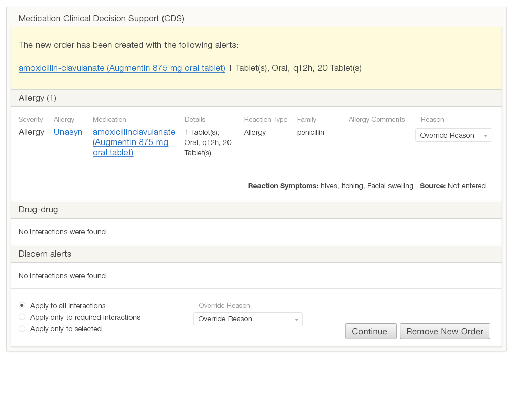
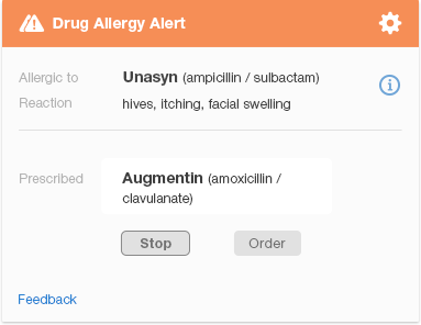
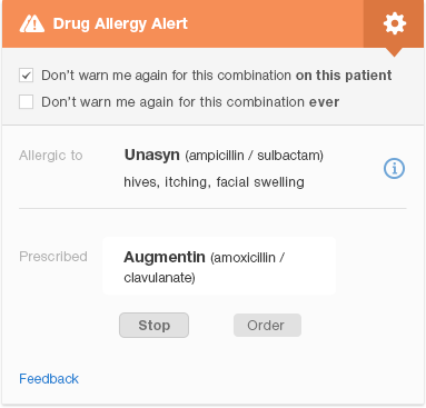
Figure 6.2 is a redesigned version of the same penicillin family drug-allergy alert. It allows the physician to see at a glance that the alert indicates a serious drug allergy (as noted by the two caution icons). The alert conveys the names of the drugs involved, and key facts about the patient’s reaction. It shows the physician what actions she can take and which one is recommended ("Stop Augmentin," where “Stop” is the more prominent button). The design visually indicates the importance of key information using different font sizes, boldface, and colors to direct the user’s eye. Gray or smaller text denotes that the information written in it is less important.
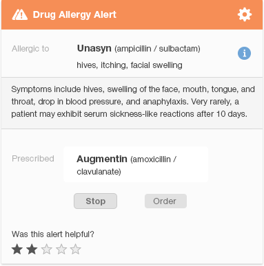
The design shows what information is related by grouping related items together, and using whitespace to separate different groups of items. We eliminated much of the text that appears in the original design (Figure 6.1) to protect the user from cognitive overload (information overload). Clicking the 'i' (information) icon to the right of the name of the drug the patient is allergic to brings up additional information about the patient’s allergic reaction. This redesigned alert allows the user to find the important information about a drug allergy quickly. If desired, they can then learn more about less vital information, like the specific details of the patient's reaction. The 'feedback' link allows the user to provide feedback to the clinical decision support team.
6.2 Drug-Drug Interaction Alerts
Drug interactions are far more complex than drug allergies. A drug allergy either exists or doesn't, though there is some room for doubt about whether an allergy was truly the issue at the time, whether the allergy still persists, and what the nature of the reaction was. With drug interactions, there are more variables: the strength of scientific evidence for the interaction, the severity category for the interaction (usually 3-5 levels from mild to severe), the organizational threshold for displaying alerts based on alert severity, and patient variables (age, weight, pregnancy, and renal function).
Clinical Scenario - Severe Drug Interaction
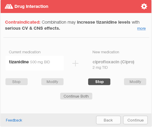
Mr. Martin, our 60-year-old who was involved in a motor vehicle accident, suffers from chronic pain. The problem requires a multi-pronged treatment approach which includes several different medications. He is taking the muscle relaxant tizanidine to treat his low back spasms. In the past two days, Mr. Martin has needed to urinate frequently and urgently, and urination has been painful. Dr. Barnes diagnosed him with a bladder infection. As she started to order the antibiotic ciprofloxacin, a passive, non-intrusive alert appeared in the corner of the screen (see Figure 6.3). Rather than completing the prescription details and selecting the pharmacy, she stopped and chose a different antibiotic for which there were no drug interactions.
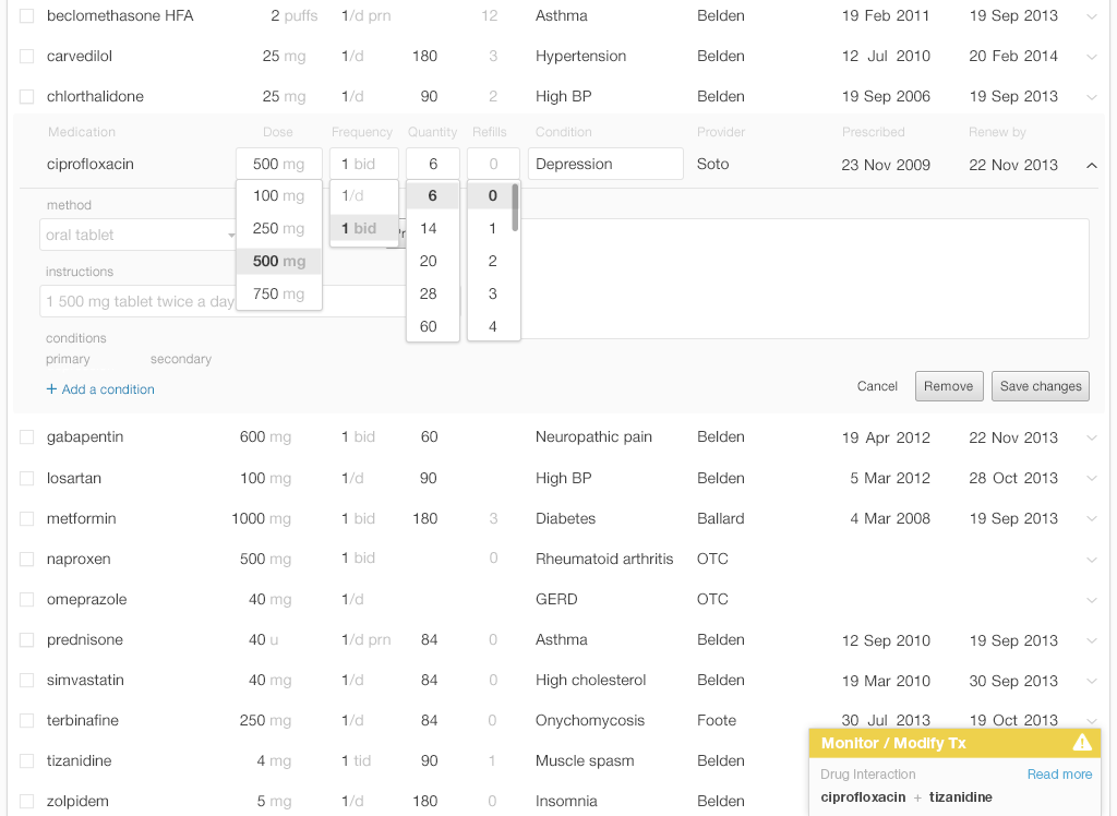
The passive alert appears in the corner of the EHR screen, but does not interrupt the physician’s workflow. The yellow bar with an alert icon that appears in the user's peripheral vision is a salient visual signal because it is based on preattentive attributes. Without reading it, the physician can detect both the alert's existence and it's degree of severity.
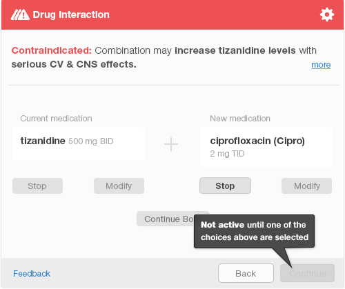
If the physician completes the order, selects a pharmacy, and sends an e-prescription, an interruptive alert will pop up to ensure patient safety. The interruptive alert stops the physician’s workflow completely, demanding the physician’s full attention. The physician must select one of the three available choices before the system activates the “Continue” button to allow the physician to move forward (Figure 6.4). After making a selection, the physician confirms her choice by hitting the keyboard “Enter” key or clicking the aforementioned “Continue” button (Figure 6.5). This additional step allows the physician a chance to correct a mistake.
Interruptive alerts annoy physicians and reduce the overall effectiveness of such alerts, which causes physicians to miss alerts that truly are important. Interruptive alerts can be used sparingly. Some EHRs allow users to customize what alerts appear to what healthcare providers. Thus the EHR might use interruptive alerts only for truly serious alerts when a physician is working with it and use both serious and mild alerts when the dispensing pharmacist is working with it. One empirical study of alerting systems suggests that physicians are more likely to comply with a tiered alert system (passive for lower risk and interruptive for higher risk alerts)1.
6.3 User Preferences to Dismiss Future Alerts
When users are presented with a high frequency of low-value alerts, they develop alert fatigue and begin to dismiss the alerts before they fully read them or consider their implications.
Alert fatigue can be mitigated in a variety of ways:
- Prevent alerts where possible:
- Offer only choices that will not trigger alerts (for instance, only offer available dosage forms)
- Provide cognitive support to help physicians make decisions that will not trigger alerts
- Adjust alert thresholds to present users with only the most important alerts
- Use a tiered alerting system: make lower risk alerts passive and less visually obtrusive. Use interruptive alerts only for those with the highest risk.
- Present passive alerts as early as possible during decision making. For example, by providing a visible indication of drugs that conflict with patient allergies or current drugs while the physician is choosing from a list or typing in a drug.
- Allow users to customize their alert settings and turn off alerts that are of no value to them.
- Make alerts easier to read. Write concise descriptions, put important words first, and use visual features (font size, emphasis, color, whitespace, alignment, and spatial grouping) to indicate the importance and relationships among the information.
6.4 Customizing Alerts for Individual Physicians
Some alerts will be predictably and safely dismissed 100% of the time, and can reasonably be eliminated. Perhaps a patient has been taking a medication for a long time without incident, but an alert still appears every time the prescription is renewed. Here are some common examples:
Clinical Scenario &emdash; Patient Can Tolerate Medications Related to an Allergy
The patient is allergic to sulfa, but has been taking a distant chemical relative of sulfa drugs, such as the diuretics hydrochlorothiazide or chlorthalidone (both very commonly prescribed), without incident for some time. In this context, the EHR need never again warn the physician about this particular patient’s allergy to sulfa.
Lisinopril (an ACE inhibitor) gives this patient a cough, and an alert appears when the physician tries to prescribe an ARB such as losartan or valsartan, because these two classes of drugs are somewhat related. However, ARBs are known to never cause the cough that ACE inhibitors may cause. The EHR need never again warn the physician about this particular side-effect for any patient.
It would be safe to allow physicians to permanently suppress alerts in the two circumstances above (Figure 6.6). It is more challenging to define rules for drug interactions or drug-disease interactions when the dosing or disease severity can vary over time.
6.5 Multiple Drug Alerts
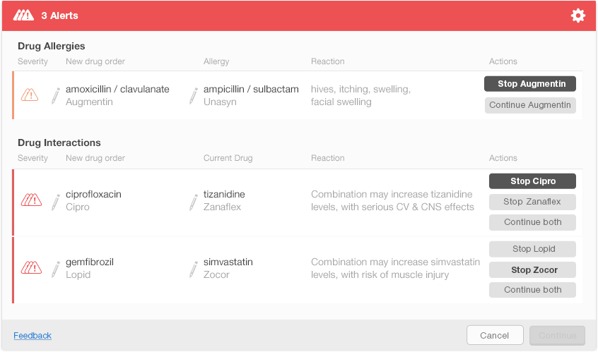
Sometimes an EHR needs to present multiple alerts to the user. These may be multiple alerts for a single medication, or several alerts for a number of different medications. Would the EHR display these alerts one at a time, or all at once? If they’re displayed all at once, physicians can see the big picture: all of the drug-allergies and drug-drug interactions in play. Without having to navigate to read each alert, physician’s can run down the list and make decisions for each item. Showing all the alerts simultaneously, however, may visually overwhelm the users. It might also be difficult to simultaneously show both all the alerts and the clinical information that physicians need to act on these alerts.
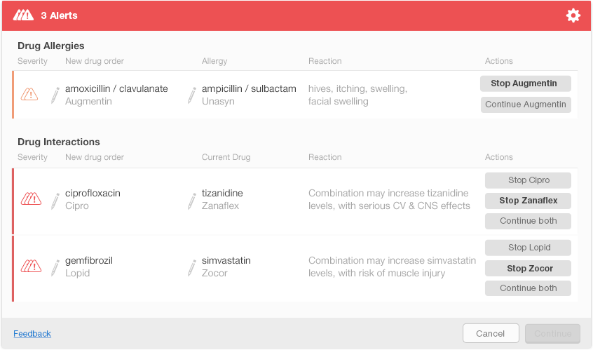
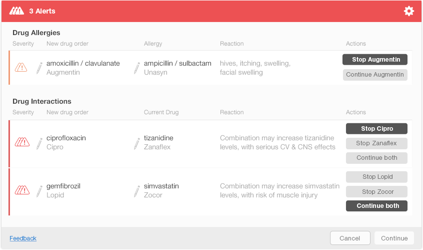
Figure 6.8 shows one possible way of presenting multiple alerts on a single screen. This design shows each alert’s severity using small icons in the left column. New drug orders and either the allergy or interacting drug are displayed just after the severity icons. The rightmost column shows the actions that a physician can take to address each alert. The action buttons include both the actions and the drug names (e.g., Stop Augmentin) to help the physician understand what each button does. The design uses bold text on action buttons to show recommended actions for each alert. Figure 6.9 shows the display after the user has made decisions about the first two alerts. The Continue button activates after the user addresses all the alerts (Figure 6.10).
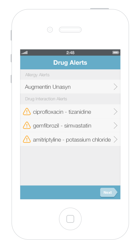
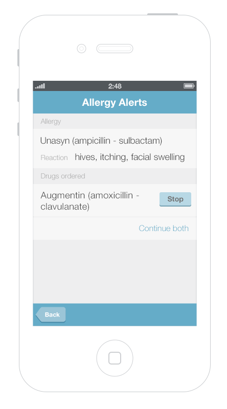
It’s more challenging to display multiple alerts on small mobile devices. Gallery 6.1 shows a way to displayed and address multiple alerts on a mobile phone. The first screen presents an overview of all of the alerts, grouped by type. Tapping an alert brings up details about it, as well as possible actions the physician can take.
This gallery shows a design option for displaying multiple drug alerts on a smartphone.
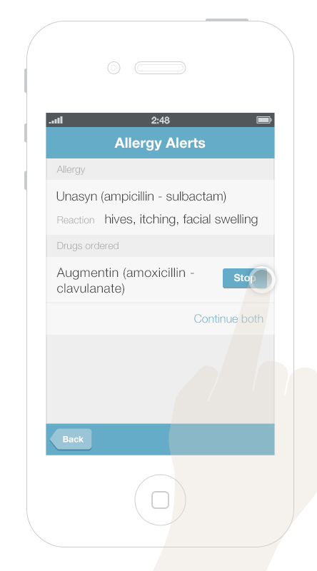
- 6.1 a One Allergy Alert and Three Drug-Drug Interactions
- 6.1 b More Detailed Display — Allows the physician to address the allergy alert
- 6.1 c Physician Taps the “Stop” Button — The display moves on, bringing up the next alert screen
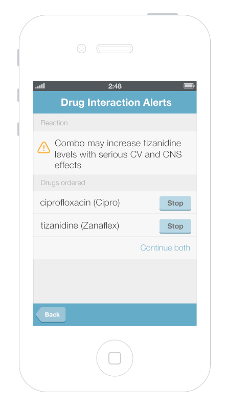
- 6.1 d A Drug-Drug Interaction Alert with Three Possible Actions — Stop the first drug, stop the second, or continue both.
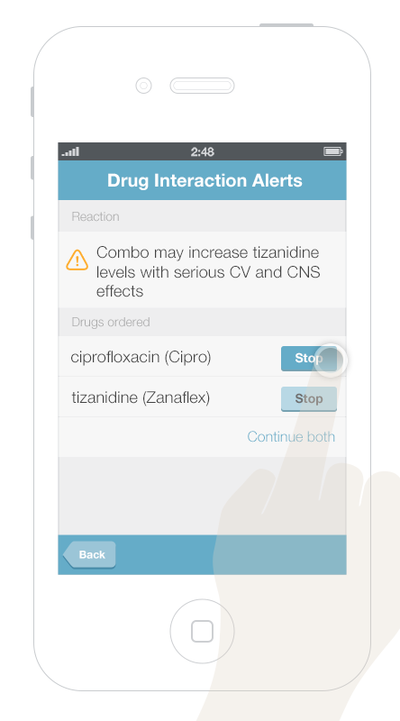
- 6.1 e Stopping Cipro Calls Up the Next Drug-Drug Alert.
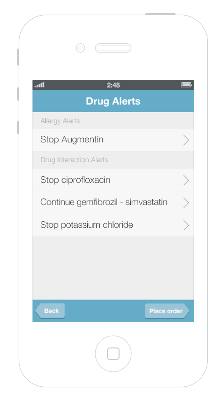
- 6.1 e After the Physician Has Addressed All the Alerts — He can use the final review screen to look over and modify his decisions.
6.6 Summary
- An effective alert is one that physicians notice, read, understand, and respond to. We can facilitate this process by designing alert systems that use sound human factors principles.
- Alerts interrupt users to different degrees. Passive alerts appear when triggered, but do not require the user to attend to them immediately. Interruptive alerts stop the user’s workflow and require the user to respond before continuing his work.
- Make only high-risk alerts interruptive.
- Reduce users’ cognitive load by simplifying the visual presentation of drug alerts.
- Use preattentive attributes (like color, size, shape, alignment) to draw users’ attention to the most important information in Drug Alerts.
- Treat alerts differently depending on their severity. Low-risk alerts can be passive. They offer the physician decision support without interrupting his workflow, unless he chooses to stop and attend to them. High-risk alerts could initially generate passive notices, but these can be followed by an active notice if the physician fails to attend to the issue. Physicians should be notified about possible issues via passive notices as early as possible.
This book was last updated 10 Nov 2014.
The designs in this book were created by our team and reviewed by a national panel of clinical and human factors experts, but have not been empirically tested against existing designs.
Additional Resources
From the National Center for Cognitive Informatics & Decision Making in Healthcare
EHR Safety Enhanced Design Briefs
Drug-drug, drug-allergy interaction checks
EHR Usability
References
- Paterno, Marilyn D., Saverio M. Maviglia, Paul N. Gorman, Diane L. Seger, Eileen Yoshida, Andrew C. Seger, David W. Bates, and Tejal K. Gandhi. “Tiering Drug-Drug Interaction Alerts by Severity Increases Compliance Rates.” Journal of the American Medical Informatics Association : JAMIA 16, no. 1 (2009): 40–46. doi:10.1197/jamia.M2808.
- http://www.ncbi.nlm.nih.gov/pmc/articles/PMC2605599/